Where will the stock market bottom out: A technical perspective

When I began writing this post, I saw that the Nifty was below 7,200. For market observers 7,200 was an important level for the Nifty. Nifty below 7,200 means that it has corrected more than 1,800 points or 20% from its all time of 9,000 made in March. The implication for investors is that we are now in a bear market. Naturally these are stressful times for many investors. We mentioned repeatedly in our blog that bull and bear markets are part of economic cycles. Market will eventually recover and make a new high, as it has always done in the past. Nevertheless, there is no denying that this kind of fall in the market is stressful for investors and naturally they want to know when the correction will end. In our post, What can we expect the equity market to do in 2016, we shared our perspectives on the various factors that will influence the global and Indian equity markets over the coming months. But if you are looking for a definitive answer to when the market will bottom out, unfortunately, I do not have an answer.
Two kinds of analyses are employed to forecast asset prices. In the first method, known as fundamental analysis, the analysts look at various economic factors that affect the asset price and forecast what these factors will be in the future. Based on the forecast of these factors, employing a variety of methodologies, the analysts forecast the future price of the asset. However, any economic forecast involves a set of assumptions and risk factors. There is always uncertainty around how the assumptions and risk factors will play out in the future. Fundamental analysis is usually long term in nature and is, in my opinion, the best method to forecast asset prices. The second method of forecasting asset prices, known as technical analysis, involves statistical analysis of historical asset prices. Technical analysts believe that the behavior of asset prices follows a pattern. Technical analysis is more useful in the short term and is widely used by professional traders. You should bear in mind that technical analysis is not 100% accurate, though most technical analysts claim that they are right 70% of the times.
In this post, we will discuss key support levels for the Indian market based on technical analysis. We can never be sure which support level will act as the market bottom, however, the market usually rebounds from key support level. For our discussion, we will use Nifty as the market proxy because I normally use Nifty for my work, but the methods discussed can be applied to any index or to any stock.
Support and Resistance Levels
As the name suggests the support level is the price at which demand exceeds supply and therefore price does not fall further. Resistance level is the price at which supply exceeds demand and therefore price does not rise further. You should understand both support and resistance levels are temporary in nature. If there is upward or downward momentum in the market, resistance and support levels are breached. However, stronger the support level or resistance level, the more difficult it is to breach these levels. We have discussed broad characteristics of support and resistance level in our article, Support and Resistance levels: Technical resistance for Nifty at 8000 to 8100 - Please read this article to understand the concepts, because we will devote the rest of this blog post on key support levels for Nifty over the coming weeks and months. Technical Analysis is a complex subject, but for the benefit of our readers we will try to keep it as simple as possible.
Support Level for Nifty
If you have been following the markets you would have heard technical experts talking about various support levels ever since the market started correcting. Did you not hear that 8500, was a strong support for the Nifty, which was revised to 8350, when then revised downwards to 8000, then 7800 and then 7500 – 7600. We will understand why the technical pros were calling out these specific support levels and why most of them were broken. For the last couple of weeks, 7100 has been called out by some pros as a very strong support and possible Nifty bottom. It remains to be seen how long will the Nifty be able to defend 7100. In my view 7100 is likely to be breached, for reasons we will discuss later in this article. Over the last few days, you may have heard about Nifty possibly going to 6,800 and even 6,500. We will understand why some experts are calling 6,800 or 6,500 the market bottom from a technical perspective.
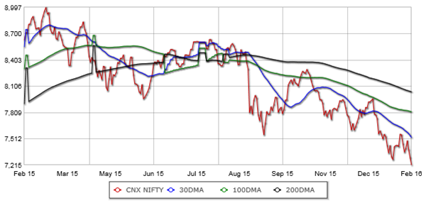
As per Technical analysis the asset prices rise or fall till a resistance or support level is reached or if there is a major event or news which triggers a price reversal. Therefore these levels are very important for technical analysis. But before discussing support and resistance level, let us understand from a technical perspective, how to determine the market trend. Technical analysis has some interesting tools, like moving averages, relative strength index (RSI) and MACD, which can give you a sense of intermediate term market direction. For beginners in technical analysis, daily moving average (DMA) is an easy to understand concept. DMA, as the name suggests, is the daily moving average of the asset prices over a certain rolling period. For example, the 30 DMA of Nifty is the daily moving average of Nifty over the last 30 days. The DMA itself is not as important as its trend is. The trend of 30 DMA will give you the short term direction of the market. The 100 DMA and 200 DMA will give you the long term direction. The chart below shows the daily Nifty price chart and the important DMA trends over the last one year.
Source: Equitymaster
The market is bullish if the 30 DMA is above the 100 DMA, which is turn is above the 200 DMA. In the chart above, we can see that the 30 DMA showed a reversal in trend in last year March itself, which should have been an early indicator for investors. The 30 DMA crossed below the 100 DMA in April 2015 and 200 DMA in May 2015. This should have reinforced the earlier bearish signal. From August 2015 onwards, 200 DMA is above the 100 DMA, which in turn is above the 50 DMA. Further, all the three DMAs are trending downwards, as of even today (February 11, 2016). The market is clearly bearish.
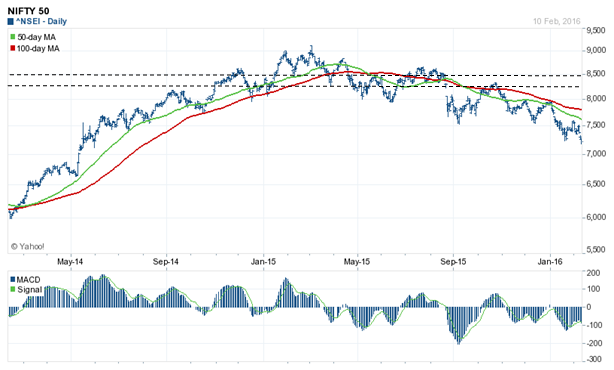
Let us now understand the different key support levels over the past one year that we referred to earlier. The chart below shows the movement of Nifty over the past 2 years.
Source: Yahoo Finance
To determine support levels in a downward trending market, you should pay attention to levels from which prices reversed earlier because these are likely to keep support levels. Focus on the two dotted lines in the chart above, because market reversed from these levels temporarily. These were the 8,500 and 8,350 levels. But in April itself, it was clear from a technical viewpoint, that these levels would have been broken. How? Let us introduce another important technical analysis tool, Moving Average Convergence Divergence or simply MACD. By definition, MACD is the difference of 12 day exponential moving average and 26 day exponential moving average (exponential moving average or EMA is a variation of the DMA). Let the jargons not put you off. You do not have to worry, how to calculate MACD. Most technical charts (on Yahoo Finance and other finance websites) show the MACD histogram. What is useful for investors is to know how to use MACD. MACD is momentum indicator. MACD oscillates above and below the zero line. Positive MACD means upside momentum is increasing, which negative MACD means downside momentum is increasing. In April itself the MACD went into the negative territory and therefore these it was likely that these support levels would have been broken.
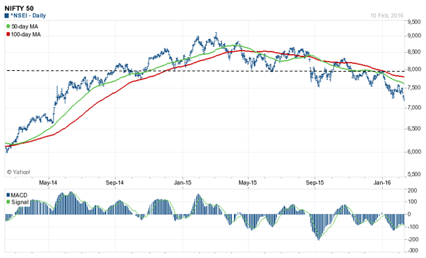
Let us now understand why 8,000 was an important level. Let us revisit the 2 year price chart of Nifty.
Source: Yahoo Finance
Remember round numbers are always important psychological levels (refer to our article, Support and Resistance levels: Technical resistance for Nifty at 8000 to 8100). Now focus on the dotted line. The market reversed a number of times from the 8,000 level and therefore it was a strong support level. Further look at the MACD histogram below. The MACD went into the positive territory indicating temporary pullback. Why temporary? Because the notice the green and red lines indicating the 50 and 100 DMA. The green line (50 DMA) moved below the red line (100 DMA), which as we discussed earlier is bearish. The 8,000 level was broken convincingly as the MACD again moved into negative territory in August.
The dotted lines in the chart below shows the next support levels for the Nifty, once the important 8000 level was broken. The logic of these support levels is the same as discussed above. Nifty did some pull-back from 7500 to 7600 levels, but the momentum indicators both DMAs and MACDs were giving bearish signals. The 100 DMA was above 50 DMA and the MACD was in the negative territory. Once 7500 – 7600 was broken, it would really be a free fall for the Nifty except perhaps some support at 7,100. However, it is unlikely that 7,100 would be defended because the momentum indicators like DMA and MACD are negative.

Source: Yahoo Finance
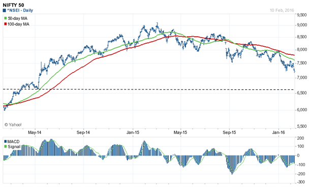
From 7,100 it is really a free fall as you can see in the chart below. The next support is around 6,500 (see the dotted line).
Source: Yahoo Finance
6,500 is nearly a 10% drop from February 10 2016 Nifty close. Is there support between 7,100 and 6,500? Some technical analysts have been saying that 6,800 is a strong support. How did they come up with 6,800? Technical analysts use another tool, known as trend-lines to determine support levels. Trend line is the best fit line joining the market bottoms or tops. Trend line is extremely important in technical analysis. There is a saying in technical analysis, “The trend is your friend”. Upper trend line (joining market tops) and lower trend line (joining market bottoms) represent the channel in which the market will be. Focus on the lower trend line, because we are discussing support. Extrapolated to today, the lower trend line indicates support at 6,800. This will be an important support level.
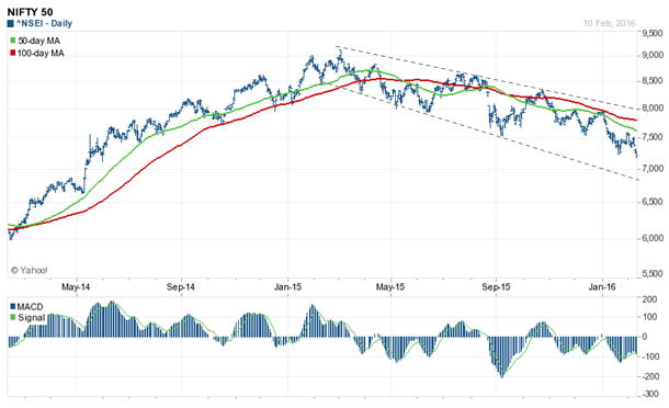
Source: Yahoo Finance
Conclusion
As I finish this blog post, the market had one of its worst days today. The Sensex fell over 800 points and the Nifty declined by nearly 240 points. The 7,100 support level is gone now. We do not know, whether 6,800 or 6,500 represents the market bottom and neither do we want to make a guess. We have tried to explain some technical analysis concepts and tools, which you can use, if you want to tactically invest at or around key support levels. Though this post was focused on technical analysis, let me close with a fundamental perspective. About 5 years back the Price earnings multiple of Nifty was 24.5. Today the Price earnings multiple of Nifty is less than 19, which means that average valuations of Nifty stocks have compressed by nearly 25%. Without going into specific stocks, I will argue that 25% P/E compression presents very attractive valuations for investors. When the market reverses the downward trend and it will for sure, long term investors stand the chance to get very attractive returns from both earnings growth and P/E expansion.
Queries
-
What is the benefit of mutual fund STP
Aug 29, 2019
-
How much to invest to meet target amount of Rs 2 Crores
Aug 26, 2019
-
Can I achieve my financial goals with my current mutual fund investments
Aug 24, 2019
-
Can you tell me return of various indices
Aug 19, 2019
-
What would be the post tax return on different investments
Aug 18, 2019
-
Which Principal Mutual Fund scheme will be suitable for my retirement corpus
Aug 16, 2019
-
What is the minimum holding period for availing NCD interest
Aug 4, 2019
Top Performing Mutual Funds
Recommended Reading
Fund News
-
Kotak Mahindra Mutual Fund launches Kotak Nifty200 Value 30 Index Fund
Jan 15, 2026 by Advisorkhoj Team
-
Bandhan Mutual Fund launches Bandhan Silver ETF FOF
Jan 12, 2026 by Advisorkhoj Team
-
Bandhan Mutual Fund launches Bandhan Gold ETF FOF
Jan 12, 2026 by Advisorkhoj Team
-
The Wealth Company Mutual Fund launches The Wealth Company Gold ETF FOF
Jan 9, 2026 by Advisorkhoj Team
-
Mahindra Manulife Mutual Fund launches Mahindra Manulife Innovation Opportunities Fund
Jan 9, 2026 by Advisorkhoj Team


