Market correction from near all time high: Technical Perspective

Over the last few days the Nifty corrected from its 52 week high of 8,969 to 8715 (as on September 9, 2016). This 250 point (approx) correction may have come as a surprise to some investors, but to readers who have followed our technical analysis blog over the past few months it should not have come as a surprise. Levels from which prices correct after a rally are known in technical analysis as Resistance Levels, whereas levels from which prices rise after a correction are known as Support Levels.
As the name Resistance and Support suggests, Resistance levels prevent asset prices from going up, while Support levels prevents asset prices from going down (please see our post from two years back, Support and Resistance levels: Technical resistance for Nifty at 8000 to 8100). While technical levels are meant to be breached eventually, but they can influence short term prices. Nifty made an all time high of around 9,100 in March 2015 and then corrected 25% from that level in about 12 months. Nifty level of 9,000 or thereabouts was, therefore, a technical resistance. Markets have memory and therefore, it was expected that prices will correct, once the market reaches its all time high. Therefore, it is only to be expected that prices would have corrected from 9,000 or thereabouts on the Nifty.
In our technical analysis post in mid February (Where will the stock market bottom out: A technical perspective) charts showed us that, the market may bottom out at around 6,800 and it did. In our post Budget article in early March (Understanding the post Budget market rally: Will it be sustainable) technical indicators showed us that, the market could rally to 8,000 if it breached the 7,500 – 7,600 resistance levels and it did. In our early June post, Nifty is now back above 8000: Is it time to be bullish or cautious, we discussed that 8,400 – 8,500 and 8,700 were the resistance levels and should it breached, Nifty was headed higher. We also discussed in that post that, technical indicators were signalling a bullish bias in the market.
The Nifty did breach 8,700 and rallied to almost 9,000. Investors and traders must understand that technical analysts are not oracles; they cannot foretell the future. Technical analysis is stochastic and not deterministic (in other words, technical analysis can never claim to be 100% accurate). Technical analysis is based on three foundational assumptions:-
- Market discounts all information
- Prices follow trends
- History repeats itself
In this post, we will not get into an intellectual discussion on whether these are good assumptions or not, but history has shown that, technical analysis does a good job at predicting short term to intermediate price movements. We had discussed earlier in our technical posts that, in technical levels from which prices have reversed historically act as support or resistance levels. As such, it was only to be expected that, levels of 9,000 or thereabouts on the Nifty would act as a resistance level, which it did over the past 3 – 4 days.
Now that we have seen a correction of 250 points from the 52 week high of the Nifty, in this post we will discuss what the key support levels for Nifty and also simple technical indicators, which can indicate trend reversal. But at first, let us discuss the intermediate term trend of the Nifty. In this post, we will focus purely on technical analysis and will refrain from a discussion on the economic factors affecting the market now. Readers should note that, the technical analysis concepts, discussed with respect to the Nifty are equally applicable for individual stocks.
DMAs and Intermediate term direction of Nifty
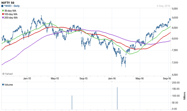
In our previous technical posts, we had discussed DMAs and their importance with respect to trend in prices. For benefit of readers who are not familiar with the concept of DMAs, DMA is the daily moving average of the asset prices over a certain rolling period. For example, the 50 DMA of Nifty is the daily moving average of Nifty over the last 50 days. The DMA itself is not as important as its trend is. The trend of 50 DMA will give you the short term direction of the market. The 100 DMA and 200 DMA will give you the longer term direction. The market is bullish in the short term if the 50 DMA is above the 100 DMA and in the moderate term if 100 DMA is above the 200 DMA. Let us now look at the 2 year daily price chart of Nifty.
Source: Yahoo Finance
In the chart above, you can see that the 50 DMA crossed over the 100 DMA and 200 DMA in May / June. The 100 DMA crossed over the 200 DMA in July / August. These are bullish crossovers, and therefore this signifies the intermediate term trend in the market will be bullish. If you have an intermediate term investment horizon, you should pay attention to 50, 100 and 200 DMAs.
MACD and Market Momentum
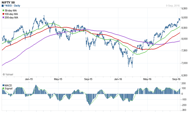
Moving Average Convergence Divergence (MACD) is a momentum technical indicator (we had discussed how MACD is calculated in our post, Where will the stock market bottom out: A technical perspective). It is typically shown as a histogram in the bottom portion of the most technical charts (you can find technical charts of Nifty and stocks on Yahoo Finance and many other finance websites). MACD histogram oscillates above and below the zero line. Positive MACD histogram (positive divergence between MACD and signal line or 9 day EMA) means upside momentum is increasing, which negative MACD means downside momentum is increasing. Let us now look at the 2 year daily price chart of Nifty and the MACD oscillator.
Source: Yahoo Finance
You can observe that, the MACD histogram crossed over into the bullish territory (above zero) in early March 2016, and as such we have had a rally since then. The MACD oscillator still indicates bullishness in the market. This confirms the bullish crossovers and trends of 50, 100 and 200 DMAs. We can therefore say that, the intermediate term trend of the market will continue to be bullish. However, readers can ask, if MACD oscillator has been bullish, why did we have a 250 point correction in the last 3 days? We had discussed earlier that, technical analysis is not an exact science. In technical analysis, different indicators can give different signals. When different technical indicators give conflicting signals investors should be cautious. In the past few days, while MACD oscillator was bullish, the RSI oscillator was signalling an over-bought market.
RSI and trend reversal
Relative Strength Index (RSI) is, like MACD, a momentum oscillator or indicator. RSI is calculated by subtracting 100 divided by 1 plus the ratio of average gain to average loss of the stock from 100. The calculation of RSI is not so important, as long as you understand the technical significance of RSI. You can see RSIs in technical charts, like on Yahoo Finance or other finance websites.
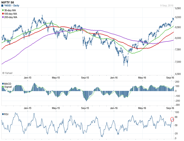
Let us understand the difference between the MACD and the RSI oscillator. The MACD oscillator indicates price momentum on either direction. The longer the bars of the MACD histogram on the either side of the zero, indicates that the momentum on the buy side or sell side is strengthening. As the bars become shorter, it implies that, the momentum on either side is weakening. Zero line MACD histogram crossovers indicate bullish or bearish signals. However, MACD can give late signals; in other words, trend reversals can happen before the MACD crossover. The RSI oscillator oscillates from 0 to 100. RSI indicates whether an asset is over-bought or over-sold. If RSI is above 70, it indicates that the asset is over-bought; if the RSI is below 30, it indicates that the asset is oversold. RSIs can give quicker trend reversal signals than MACD. Let us see how RSI gave quicker signal than MACD using Nifty daily price chart.
Source: Yahoo Finance
As mentioned in the chart, the line graph at the bottom is the RSI, while the histogram just above the RSI is the MACD. You can see that, a few days back (as indicated by the red circle), the RSI was giving signal (above 70), while the MACD histogram was indicating bullishness. As it turned out, RSI was a more reliable indicator for short term price movement compared to MACD. If you traded on the basis of RSI, you would have lightened your long positions or even taken short position when RSI was near 70 and would have made very decent profits today (please remember, however, that this is purely from short term trading perspective). In our view, while MACD is a more popular momentum oscillator (which is why, we focused more on MACD in our previous posts), technical traders should look at both MACD and RSI. If MACD and RSI give conflicting signals, traders should exercise caution and maintain strict stop-losses.
Support Level for Nifty
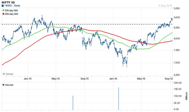
Since MACD oscillator still indicated bullishness, we do not anticipate a very deep correction from the resistance level of around 9,000 on the Nifty. However, we should track the technical indicators of the market on a regular basis over the next few days and weeks to form a more informed view. Let us now, discuss the important support levels of Nifty. If you have read our previous technical posts you will know that, markets have memories and previous support levels continue to act as support when prices are falling. We had also discussed in our previous technical posts that resistance levels, when breached, become support levels in the future. Let us now look at the 2 year daily price chart of Nifty, to get a sense of the support levels for Nifty in the near term future.
Source: Yahoo Finance
Please focus your attention on the dotted line. You can see that prices reversed from the dotted line, a number of times in the past 2 years. The dotted line on the chart above, corresponding to approximately 8,700 on the Nifty, is, therefore, is a strong support level for the Nifty. Is it any surprise that Nifty closed around 8715 today? If you believe in technical analysis, the answer is that, it is no surprise at all, because 8,700 is a strong support level. Nifty may very well rebound from this level and again test the all time high. However, as an investor, you must remember that, market is not a slave of technical analysis and that is why technical levels are breached. Global risk factors and perceptions can cause 8,700 to be breached; what, in that case, is the next support level for Nifty? Let us now look at the 2 year daily price chart of Nifty, to get a sense of the next support levels for Nifty in the near term future.
Source: Yahoo Finance
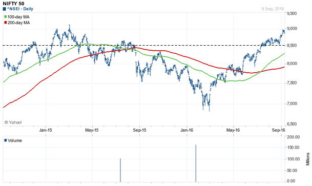
Please focus your attention on the dotted line in the chart above. You can see that, below the 8,700 level on the Nifty, prices reversed from the 8,500 levels a number of times in the past 2 years. Therefore 8,500 is the next level to watch out, over the next few days and weeks, should 8,700 be breached convincingly on a closing basis over the next few days.
Nifty intermediate term trend
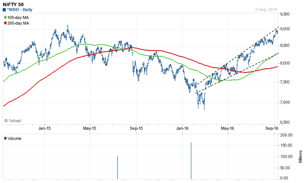
Nifty has been forming higher tops and higher bottoms over the last few months. Higher tops and higher bottoms imply that, as of now, Nifty is in an intermediate term uptrend. I have seen a number of investors, who made judgement calls that were contrary to the trend and were punished brutally by the market. Fund managers make contrarian calls and give great returns to investors, but retail investors must note that, making these calls require a considerable amount of experience, expertise and most importantly, patience to wait for the results. Focus your attention on the two dotted lines in the chart below. If you are not an expert in investing, then remember one of the most important mantras of technical is that, the trend is your friend. Trend-lines are very important in technical analysis and trading. The dotted line on the top connects the market tops, while that below connects the market bottom. In a range bound market, prices will trade between the upper trend line and the lower trend line.
Source: Yahoo Finance
You can see in the chart above that, the trend lines are upward sloping. Extrapolated to today, the upward trend line extends to above 9,000 while the lower trend line extends to around 8,300 – 8,400.
Conclusion
The trend lines, DMAs and MACD oscillator tell you that, short term volatility notwithstanding, the market has a longer term bullish bias. Therefore, if you are a longer term investor, you should use these corrections to tactically add equities to your asset allocation. Market experts tell us that, over the next few weeks, you will get further opportunities to take advantage of short term corrections, which you should take full advantage of, to get superior returns in the medium to long term.
Queries
-
What is the benefit of mutual fund STP
Aug 29, 2019
-
How much to invest to meet target amount of Rs 2 Crores
Aug 26, 2019
-
Can I achieve my financial goals with my current mutual fund investments
Aug 24, 2019
-
Can you tell me return of various indices
Aug 19, 2019
-
What would be the post tax return on different investments
Aug 18, 2019
-
Which Principal Mutual Fund scheme will be suitable for my retirement corpus
Aug 16, 2019
-
What is the minimum holding period for availing NCD interest
Aug 4, 2019
Top Performing Mutual Funds
Recommended Reading
Fund News
-
Tata Mutual Fund SIF launches Titanium Equity Long Short Fund
Apr 27, 2026 by Advisorkhoj Team
-
Quant Mutual Fund SIF launches qsif Sector Rotation Long Short Fund
Apr 27, 2026 by Advisorkhoj Team
-
Invesco Mutual Fund launches Invesco India Nifty Bank Index Fund
Apr 23, 2026 by Advisorkhoj Team
-
Invesco Mutual Fund launches Invesco India BSE Sensex Index Fund
Apr 23, 2026 by Advisorkhoj Team
-
The Wealth Company Mutual Fund launches WSIF Equity Long Short Fund
Apr 15, 2026 by Advisorkhoj Team


